The venn diagram overlap of transportation geeks and data geeks shines brightest when Trip Diary numbers are released. So despite the zillion other things I have to do, I sat down for some Excel Spreadsheet fun this weekend to look at what the Trip Diary data release tells us about New Westminster.
The Translink Trip Diary is a survey-based analysis of how people in Greater Vancouver get around. Unlike the Canada Census that asks simply “How do you usually get to work?” and “How long does that take you?”, the Trip Diary digs down into details about how people get around. What types of trips do they take, where do they go, how far, and how often? The difference matters because many people, especially those who use active transportation modes, use more than one way to get to work and travel for non-commuting reasons as well. I have two jobs, one I either walk or cycle to, the other I either cycle or ride transit (after a 5-minute walk on one end). My “usual” could be transit or cycling or walking, depending on the week. I usually walk to shopping, but sometimes drive. I sometimes drive to recreation, sometimes I bike or walk. For most of us living in a modern urban area, our modes are mixed, and understanding that mix is more important to how we plan our transportation system than the simplistic census question.
I’m going to skip over some of the regional stuff (maybe a later post when I find time because there is some fascinating data in here) to concentrate on New Westminster. All of the numbers below that I refer to as “New Westminster trips” are trips by people who call New West their city of residence – whether their trips start and/or end in New West or elsewhere in the region, every trip made by a New West resident is considered a New West trip.
The last Trip Diary provided data from 2011, and at the time, New West was doing OK as far as “mode share”, which is transportation geek speak for “what percentage of people are travelling by X mode.”
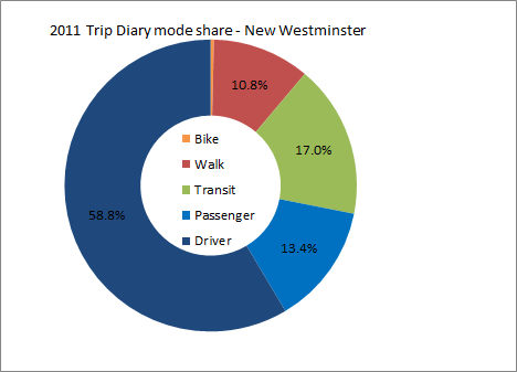
As might be expected for a compact city with 5 Skytrain stations, New West has high transit mode share at 17% of all trips. In 2011 we used transit at a higher rate per trip than any other City in the Lower Mainland except the City of Vancouver itself (at 20%). We also had higher walking mode share than most cities (11% of all trips, which is only behind Vancouver, North Van City and White Rock). Our 2011 cycling mode share was a dismal 0.4%, which was, even more dismally, close to the regional average. Add these up, and we had one of the lowest automobile mode shares in the region. 59% of trips were drivers, 13% were passengers, totalling 72% of trips, which was lowest in the region except (natch) Vancouver. Contrast that with the traffic we need to deal with and the amount of space we have given over to that traffic. But more on that later.
The 2017 Trip Diary data shows how our mode share has shifted over a 6-year span:
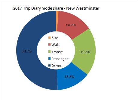 As you can see, the shift is subtle, but in a positive direction if you hate traffic. Our transit rode share went up to 20% and is now the highest in the region (Vancouver’s dropped a bit to 18%) New Westminster is now the City in BC with the highest transit mode share! Our walk share went up to 15% and is still 4th in the region, and our bike mode share doubled from dismal to still pretty bad. Or car mode share, however, dropped from 72% of all trips to 64.5%, and “passengers” went up a little bit in share, suggesting that single occupancy vehicle trips went down. Going from 59% to 51% of driving trips in 6 years is (a 14% decrease) is a really positive sign for the livability of our community.
All of those numbers are percentages of trips, but they mask that New Westminster is a growing city. Based on BC Government population estimates (BC Gov’t Local Government Statistics Schedule 201), our population went from 67,880 to 73,928 over that 6-year span, an 8.9% population increase. The trip diary raw numbers show that our number of trips went up at a higher rate: a 12% increase from 194,000 individual trips on the average day to 217,000 trips. We are moving around more. And this is where things get interesting: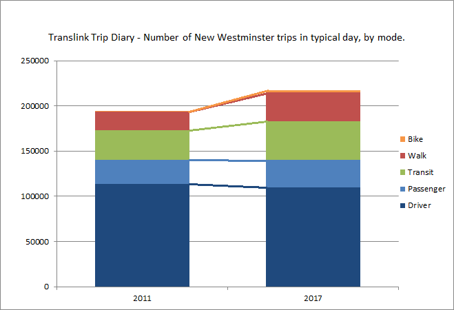
With a modest increase in cycling (around 1,000), and significant increases in walk trips (11,000) and transit trips (10,000), there was no increase in trips taken by car – the increase in passengers almost exactly offset the reduced trips by drivers. I need to emphasize this, in bold, italics and in colour, because this is the big story in all of these numbers:
All of the new trips taken by New Westminster residents, as our population grew by 8.9% and our travelling around grew by 12%, resulted in no increase in car use by residents of the City. All of the extra trips were counted as transit, walking, or cycling. Simply put, this logical connection perpetuated by people who oppose the transit-oriented development model, is not supported by the data: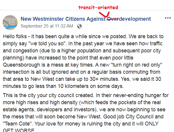
Admittedly, this does not necessarily mean traffic is getting better; That a smaller proportion of people are driving and that driving is becoming less convenient, are not contradictory ideas. Other parts of the region have not seen the same shift, and growth to the south and east of us especially is increasing demand on our local roads. This also means there are more pedestrians and cyclists about, so crosswalks are fuller and taking more time to clear, meaning some tiny amount of through-capacity from cars is lost to accommodate the mode shift and keep vulnerable road users safe. The City shifting resources to serve the growing proportion of our residents that don’t rely on a car every day also makes sense from a planning principle. If I am car-reliant (and some in our City definitely are) I can rest assured that a huge proportion of our public land space is still dedicated to moving and storing cars, and a large portion of our budget to accommodating the expectations of drivers.
But the writing is on the wall, and we need to continue to adapt our practices and resources to reflect the success that is starting to show in our regional transportation numbers.
Very interesting data crunching. Thanks for creating & sharing! Remarkable for car use to be kept flat even in light of 8.9% population increase.
Pat, why are your 2011 New Westminster daily mode share figures vastly different than what is in the official New Westminster Master Transportation Plan? In the plan the 2011 auto driver and passenger trips account for 64% and pedestrians 15%. You have over 72% and 11% for these figures. Every % matters when it comes to mode shares, so these differences are appalling.
Good Question! The MTP uses the 2011 National Household Survey – which is census data. The question asked is “what mode do you most often use to get to work”. That is a very different question than the TransLink Trip Diary asks: “for all of your trips this week, which did you take by which mode?” This is what I am talking about in the second paragraph of the post. Trip Diary data is way better, but harder to collect.
Firstly, to not reference the data source is just plain wrong. No one should have to deduce the source of this critical data.
The MTP quotes the mode shares representing daily trip totals, as mentioned in the text and the subsequent graph. That then suggests they used the Trip Diary data as the trip diary is a daily survey. The 2011 National Household Survey is only for commuting trips which are about just over 30% of daily trips. On page 25 it quotes the national figures as commute trips only. It would be wrong to use this for transportation planning unless that is all you have. So the MTP has to be using trip diary data and why would they not as regional data has been around since the 80’s.
But it seems the MTP and your figures are disconnected. Either you are wrong or the MTP is wrong. If it is the latter then you have not only a planning problem, but an accountability problem as you cannot meet a target that is incorrect. The main justification of the MTP and the millions in projects the plan refers to hinges on the mode share and it is currently a mystery. Also where is the analysis to indicate that the array of capital projects and programs are adequate to meet the plan’s targets?
Poor baseline analysis. Improper targets. No analysis or business case of future projects. MTP: Master Transportation Plan or Messed-up Transportation Plan?