We have had a couple of presentations to Council by the reinvigorated HUB Chapter for New Westminster. I have been a long-time supporter of HUB (through membership and donations), used to serve as a community representative on the Advisory Committee for Bicycles, Pedestrians and Transit (ACTBiPed), am now Chair of that committee, and even have my name attached to the city’s Master Transportation Plan as a community member of the Master Transportation Plan Advisory Committee, so I feel pretty close to this issue. I thought it was time to write a bit of an essay on where I think we are, and where we need to be going as a City when it comes to transportation. And it isn’t all good.
I need to start this by interject one of my usual caveats about how everything you read here is my opinion, coming out of my brain (or other internal organs, commonly spleen) and not official communication from the City. I am one member of a Council of 7, and they may or may not share my opinions on this stuff. There are staff in the City doing their jobs with much more engineering and planning expertise than me who may cringe in reading my relatively uninformed take. So nothing here should be taken to represent the thoughts, feelings or ideas of anyone or any organization other than myself.
The same goes for my random tweets that sometimes get picked up by the media. I was recently critical on-line of a change in the BC Parkway along my regular-job commuting route that made cycling along the parkway less safe for cyclists and pedestrians. After getting re-printed, I felt the need to state that I recognize New West has some work to do on this front as well, but I like to hope that despite our being slow at improvement, we are not actively making things worse. It is the pace of improvement that I want to lament now.
I am a little frustrated by our lack of progress on building a safe and connected cycling network in New Westminster. I understand a little more now in my role about why we have been slower to act than I like, but I think it is time for us to stop looking at lines on maps and start building some shit.
Up to now, work on the Master Transportation Plan implementation has emphasized things that I think needed to be emphasized in our transportation space – curb cuts, making transit stops accessible, and accelerated improvement of pedestrian crossings. these are good things that deserved investment to remove some of the barriers in our community that represented some obvious low-hanging fruit. We have also staffed up a real Transportation department for the first time, so we have engineers and planners dedicated to doing this work, and they have been doing some really great work.
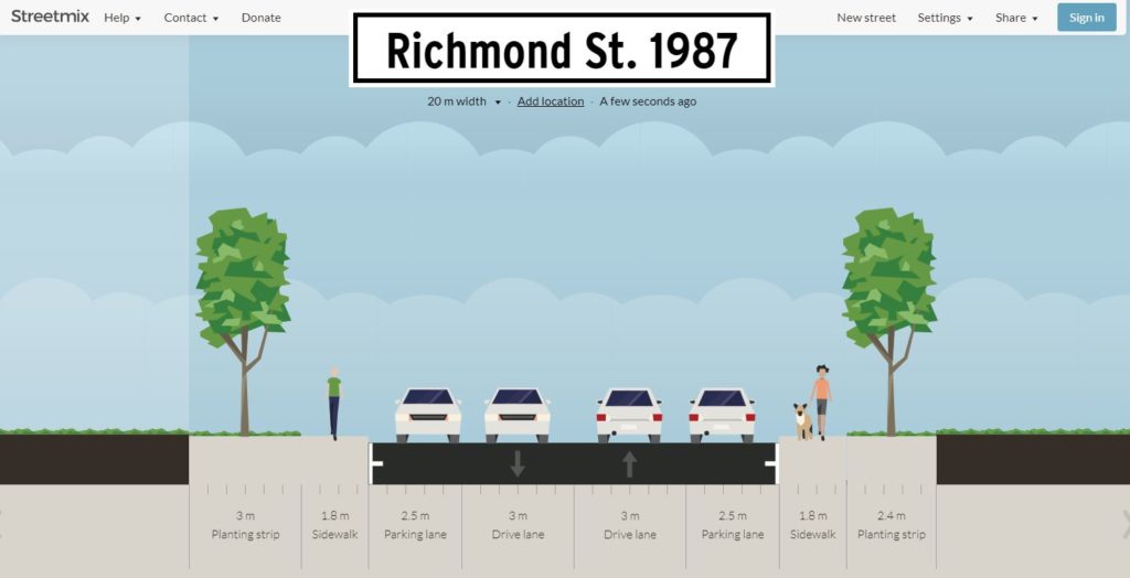
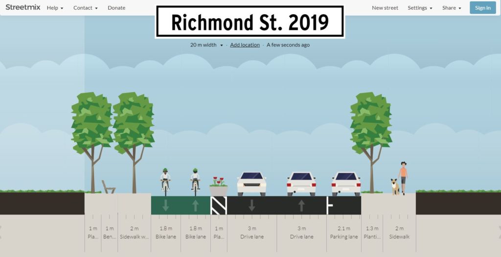
We have built some stuff! There are areas we have improved, and though they are better than what was there previously, I cannot believe anyone would look at some of this infrastructure and see it as truly prioritizing cycling, and (more to the point) few of them meet the mark that we should be striving for – All Ages and Abilities (AAA) bike routes that an 8 year old or an 80 year old would find safe, comfortable and useable. As I am learning in this role, each project has its own legacy of challenges – resistant neighbours, limited funding, tight timelines to meet grant windows, unexpected soil conditions. Every seemingly bad decision was made with the best intentions as the least-bad-of-many-bad-options. But we need to do better, and that means spending more on better.
So, much to HUB’s points, there are a few projects I think the City needs to get done soon, and I hope we can find the capital to make happen, even if they are not as sexy as some region-defining transportation links, they are fundamental if New Westminster is going to take the next steps towards being a proper 21st century urban centre:
7th Ave upgrades The existing temporary protected bike lanes on 7th Ave between Moody Park and 5th Street are getting torn up right now as scheduled water main and service works are happening under that street. I am adamant that permanent protected AAA bike lanes need to replace them. This is the part of the established Crosstown Greenway that sees the most non-active traffic, and is probably the least comfortable part as it also sees its fair share of rush hour “rat runners”. The rest of the Crosstown Greenway could use some enhanced traffic calming, pavement re-allocation, and cyclist priority in some intersections, but it is this 300m section where true separated lanes are the only way all users will feel safe.
Connection to the High School Related to this, the new High School will be ready for students a year from now, and we have not done anything to assure that students of the school can safely connect to Crosstown Greenway and the adjacent neighbourhoods. The sidewalks along 6th and 8th are barely adequate now for the mass of students that pour out of the school when a bell rings, and the new site is going to be more constrained for parent drop-off and pickup, so the City needs to build safe connections. In my mind, that means separated bike route along 8th Street to Moody Park and widened sidewalks along 6th Street to 7th Ave, but I’ll leave the engineers and transportation planners to opine on what we need to build – I just want to get it built so that the new school is one that encourages students to walk, roll, bike, or scoot there.
Agnes Greenway Bikeway Another major construction project in town will be starting the fall (hopefully), and is scheduled to be completed in 2023. At that time, the Pattullo, which is the second-worst crossing of a river in the Lower Mainland for bikes (Knight Street is worse, and the tunnel doesn’t count) will be replaced with what could be the best active transportation crossing in the entire region – and it will see a concomitant increase in use. There is a lot of work being done in the City with the Ministry of Transportation to assure people landing in New West by bike or scooter have decent connections to the existing network. At the same time, we need to fix the crappy connections people trying to move east-west past the bridge now have to deal with. Agnes Street should be that connection for most of our Downtown, should provide proper AAA connections for all downtown residents to QayQayt Elementary, and can be the foundation for the much-needed-and-never-quite-done Downtown-to-Uptown grade-reduced route. This is as key to New Westminster’s Active Transportation future as the Burrard Street Bridge and Hornby Street bikeways were to Vancouver a decade ago. We need to see that vision, do it right, and make this the one gold-plated piece of bikeway infrastructure to hang all of our other dreams upon.
Uptown/Downtown connection Much like the Burrard Bridge example, the connections to the Agnes Bikeway are as important as the Bikeway itself. The Agnes Bikeway will only be transformational if it connects safely to the “heart” of downtown, which is and will continue to be the corner of Eighth Street and Columbia. It also needs to connect to a proper AAA route across Royal. HUB and ACTBiPed have talked at length about potential lower-grade routes from Columbia to Royal using the same thinking as “The Wiggle” in San Francisco, and a preferred route has been identified. However, the solution above and below Agnes are both going to require difficult engineering choices and potentially more difficult political ones.
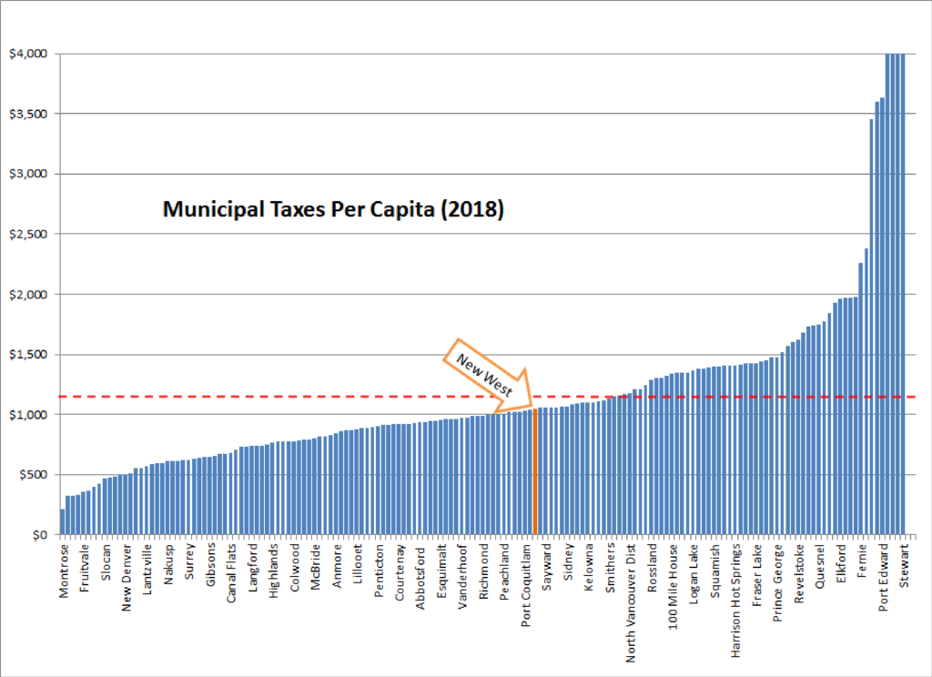
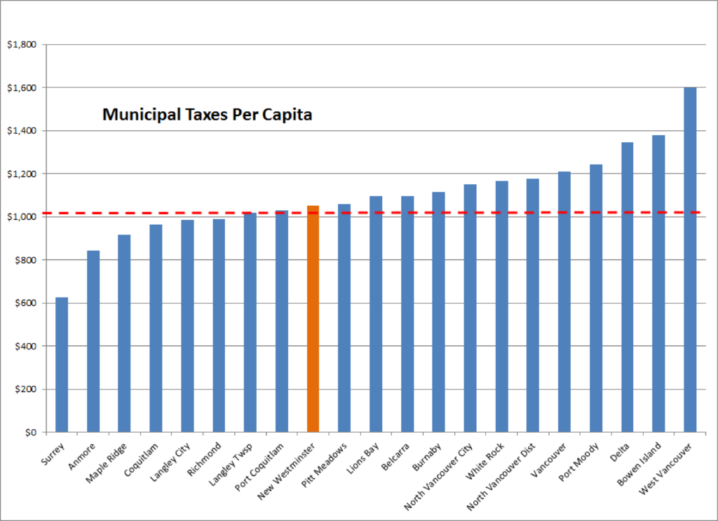
Priorities set, that brings us to the bad part. Roads are expensive, and completely re-configuring how a road works is really expensive. Moving curbs, adjusting drainage, digging up the road, bringing in proper fill materials, asphalt, concrete, street lights, power poles, moving trees, epoxy paint – it all adds up. Right now cities like Vancouver budget about $10 Million per kilometre of separated bike route installation on existing roads. Long-term maintenance costs are likely lower than the driving-lanes-and-free-car-storage we have now on these routes, but there is no getting around that up-front ding to the budget.
Using the thumbnail estimate from Vancouver, the priorities above could total up to $20 Million, and my dream is to see this happen within the timeframe of our current $409 Million 5-year capital plan. About $155 Million of that is utility upgrades (water, sewer, and electrical), and another ~$100 Million is for the replacement of the Canada Games Pool and Centennial Community Centre. Somewhere in the remaining $150 Million we need to think about the cost of reducing the fossil fuel requirements of our fleet, pay for the current City Hall upgrades and the completion of the animal care facility in Q’Boro, among other projects. We have serious costs coming up – those $150 Million are already committed. And everyone who doesn’t love bikeways is going to hate them more when I suggest $20 Million over 5 years is about a 1% tax increase. I already get grief from some cohort in the City because I “talk too much about bikes”.
Fortunately, we are not alone. TransLink is investing in Active Transportation like never before, both in its role as the regional Transportation Authority, but also in recognizing that people are more likely to buy a ticket for SkyTrain if their 15-minute walk to SkyTrain is replaced with a safe and comfortable 5-minute bike ride. The Province recently released their Active Transportation Strategy, and at least one Federal Party in the upcoming election is hoping to see more federal money pointed at more sustainable transportation options as a campaign plank. Time to strike while the irons are hot.
In New Westminster, I’m going to be making the case that in the year 2019, the creation of safe AAA-standard active transportation infrastructure is not a “nice to have”, but is an essential part of our Climate Emergency response and the most notable missing piece of infrastructure in New Westminster’s quest to be the most accessible and livable city in the Lower Mainland.
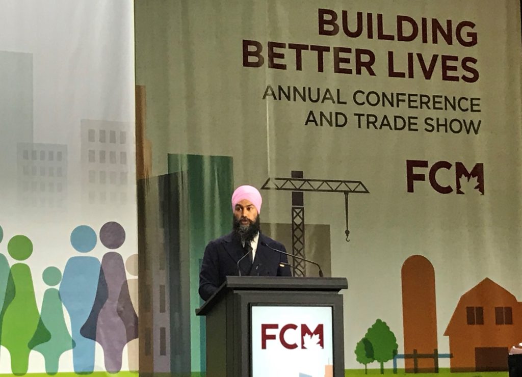 Jagmeet Singh was the first leader to open with a land acknowledgement, and the first to speak without a teleprompter. He had notes, but riffed off of them freely. His speech was good if unpolished. He promised a lot (pharmacare, broadband, infrastructure funding, removing barriers to post-secondary education), but to me the most telling part was that he was the only leader to link climate action to inequality and the need for a just transition away from fossil fuels. That was the message I wanted to hear (and increasingly, that is the message among people looking for climate action in Canada), and he delivered it clearly without equivocation.
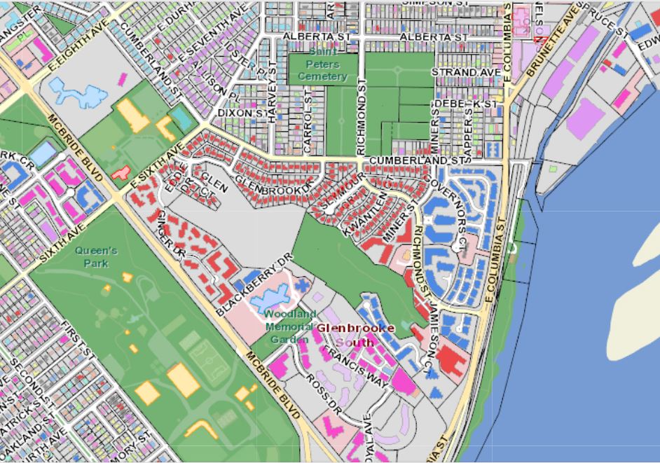
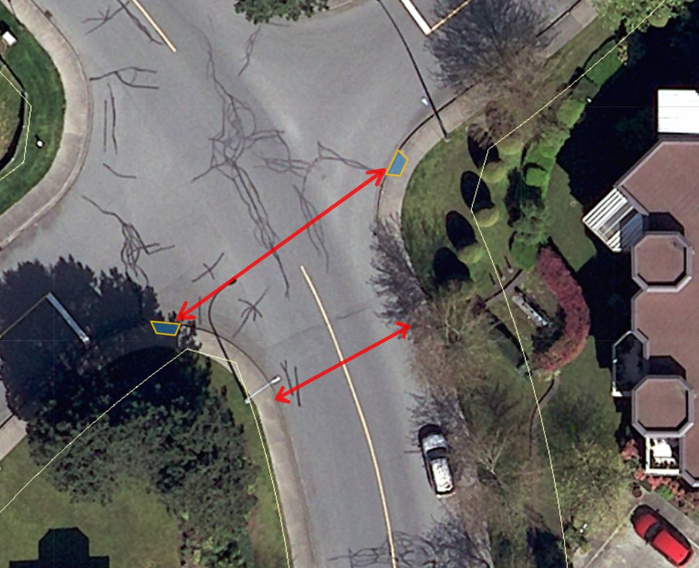
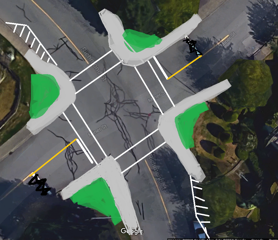
 But that is just a representative cross section. There is another issue that makes the pedestrian experience even more uncomfortable. If you look at the intersection of Richmond and Miner, where staff were asked to evaluate placing a crosswalk, you see the corners are rounded off to facilitate higher turning speeds:
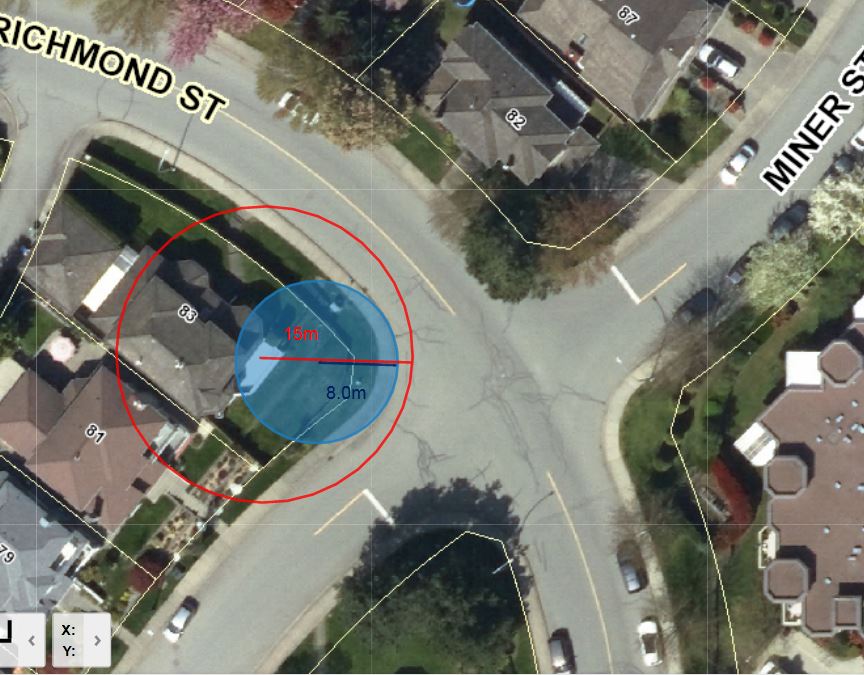 The technical term for this shape is “Corner Radius”. In this diagram you can see the curb follows a curve with a radius (blue) of about 8m, and the effective turning radius (tracing the track a vehicle would actually use for a right turn) is closer to 15m. By modern standards, this is a crazy wide corner, more suited for a race track than an urban area. Reading up on